
Barbara Book
Barbara Stauffacher Soloman
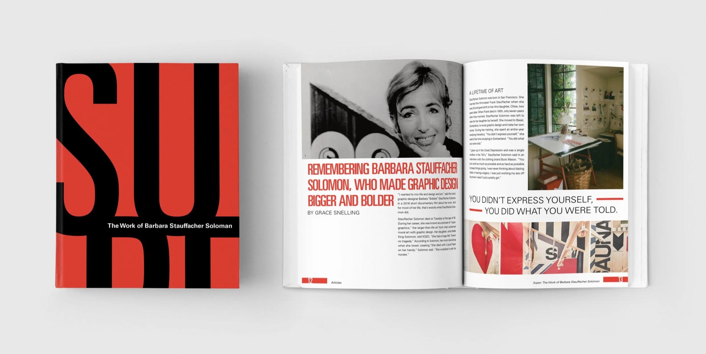
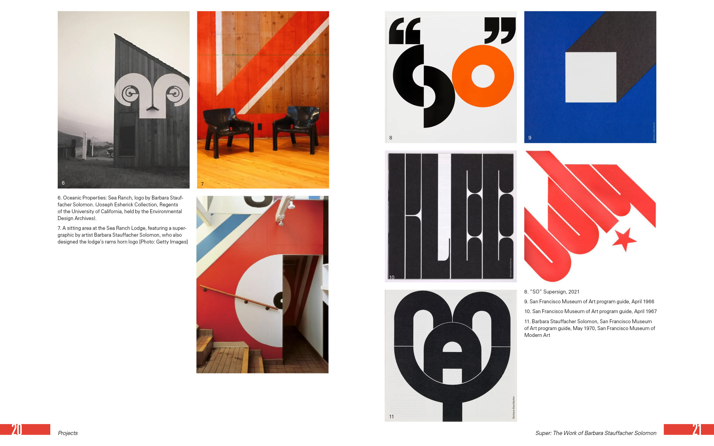
Barbara Stauffacher Solomon was a pioneering graphic designer best known for blending bold Swiss modernism with large-scale, architectural applications. A trailblazer in the 1960s, she coined the term "Supergraphics"—oversized, high-contrast designs that transformed spaces with type and color. Her style is unapologetically graphic, often merging typography, minimalism, and unexpected scale to challenge how we experience visual environments.
Channeling Supergraphics
Inspired by Barbara Stauffacher Solomon’s fearless use of scale, contrast, and space, I designed a book that reflects her iconic Supergraphic style and celebrates her contributions to graphic design. I leaned into bold typography, clean grids, and architectural rhythm, letting each page feel like a space to walk through, not just a page to read. The layout pays homage to her signature red, white, and black palette while embracing the confident minimalism that defined her legacy.


Simply Powerful
While designing this book, I learned how powerful type and layout can be in shaping a reader’s experience. I saw how careful choices in typography, scale, spacing, and composition can create rhythm, guide attention, and even express personality without relying on imagery. Working within a minimalist framework pushed me to be more intentional with every detail and showed me how restraint can often make a design feel stronger and more dynamic.
Final Outcome: